Learn how to build Christmas greeting using CSS Animations

In today's short tutorial we are going to build a christmas greeting card using CSS animations.
Here's a preview of our final greeting card which we are going to build today:-
The steps for building this greeting card are as follows:-
Step 1: Add Greeting card content
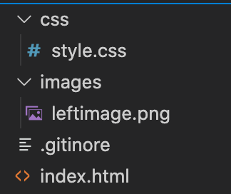
- Create a new project directory and create index.html file in which we can add our HTML code, a CSS folder which will
style.cssfor our project and a folder for our images.
- We need to use bootstrap in our project so let's add bootstrap related files in our head section and change the title. Also we need to add Dancing Script and Work Sans Google font for our design. The complete head section till this point would look like this:-
<head>
    <meta charset="UTF-8">
    <meta name="viewport" content="width=device-width, initial-scale=1.0">
    <title>New Year Greeting</title>
    <link href="https://cdn.jsdelivr.net/npm/bootstrap@5.0.0-beta1/dist/css/bootstrap.min.css" rel="stylesheet"
        integrity="sha384-giJF6kkoqNQ00vy+HMDP7azOuL0xtbfIcaT9wjKHr8RbDVddVHyTfAAsrekwKmP1" crossorigin="anonymous">
    <script src="https://cdn.jsdelivr.net/npm/bootstrap@5.0.0-beta1/dist/js/bootstrap.bundle.min.js"
        integrity="sha384-ygbV9kiqUc6oa4msXn9868pTtWMgiQaeYH7/t7LECLbyPA2x65Kgf80OJFdroafW"
        crossorigin="anonymous"></script>
    <link rel="stylesheet" href="css/style.css">
    <link rel="preconnect" href="https://fonts.gstatic.com">
    <link href="https://fonts.googleapis.com/css2?family=Dancing+Script:wght@400;700&display=swap" rel="stylesheet">
    <link href="https://fonts.googleapis.com/css2?family=Work+Sans:wght@400;700&display=swap" rel="stylesheet">
</head>
Next we need to download the image which is seen on left side of our design from Pixabay and add it in images folder of our website.
Now we are ready to add HTML content within our body tag as shown below:-
<body>
<div class="page-container d-flex justify-content-center align-items-center vh-100 flex-column">
<div class="greeting-container d-flex">
<div class="left-section">
<img src="images/leftimage.png"
alt="new year image" class="left-image">
</div>
<div class="right-section d-flex justify-content-center align-items-center flex-column">
<div class="right-section-text">
<div class="title mt-2 text-center">
Happy New Year!
</div>
<div class="description text-center">
Warm wishes from us
</div>
</div>
</div>
</div>
<div>
Image by <a
href="https://pixabay.com/users/lumixdesigner-1760432/?utm_source=link-attribution&utm_medium=referral&utm_campaign=image&utm_content=1885470">Lumix
Designer</a> from <a
href="https://pixabay.com/?utm_source=link-attribution&utm_medium=referral&utm_campaign=image&utm_content=1885470">Pixabay</a>
</div>
</div>
</body>
We have mainly used bootstrap classes with some custom classes in the above code.
- Next we will open style.css and focus on CSS part of our website. First we will define the colors required in our page using CSS variables:-
:root {
    --red-color:  #CE171D;
    --yellow-color: #F2F2DB;
}
- Next we can define CSS animations using
@keyframeCSS attribute:-
@keyframes slide-in-from-left {
    0%{
        transform: translate(-400px);
        opacity: 0;
    }
    80% {
        opacity: 0;
    }
    100% {
        transform: translate(0px);
        opacity: 1;
    }
}
We are basically keeping the left side image, out of the page in the beginning using negative value for translate attribute and then bringing it back into the page towards the end of the animation. We can define a similar animation for sliding the text from right side of the page:-
@keyframes slide-in-from-right {
    0%{
        transform: translate(400px);
        opacity: 0;
    }
    80% {
        opacity: 0;
    }
    100% {
        transform: translate(0px);
        opacity: 1;
    }
}
Now we are ready to use this defined animations using below CSS property:
animation: slide-in-from-left 1s ease-in 0s 1;
Here the first value is the animation name, second value is the total time of the animation(1s in our case), third value is type of animation, fourth value is delay in animation(0s in our case) and the last value is the animation iteration count which is 1 in our case since we want the animation to repeat only once.
We can use the above property in our CSS file as shown below:-
.left-image {
    height: 380px;
    animation: slide-in-from-left 1s ease-in 0s 1;
}
.right-section-text {
    animation: slide-in-from-right 2s ease-in 0s 1;
}
You can find the complete CSS file with other page properties here: Github
Once we are done with writing this CSS code the animation should be visible on the page when it is refreshed.
If you prefer to learn from video tutorials, you can find the complete process of building this mini project on Youtube below:-
The complete source code for this project can be found here: Github
That concludes our short tutorial on building new year greeting using CSS animation. Have fun and happy new year🥳


